I was commissioned to create different media expressions for a festival of my choice, in my case ”Mysteryland”. namely, a newspaper, an app prototype, a wordmark, and a visual identity based on experiments.
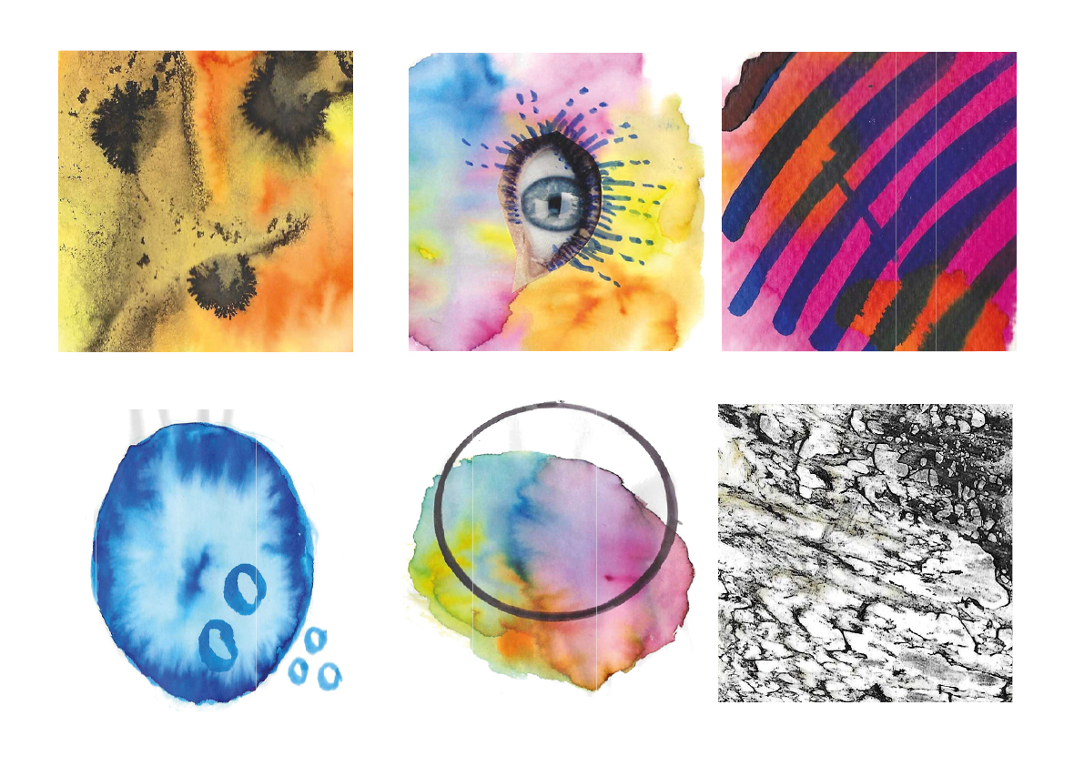
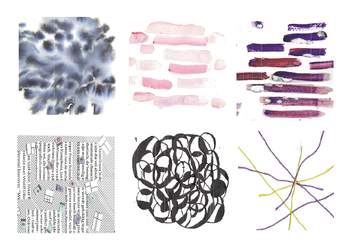
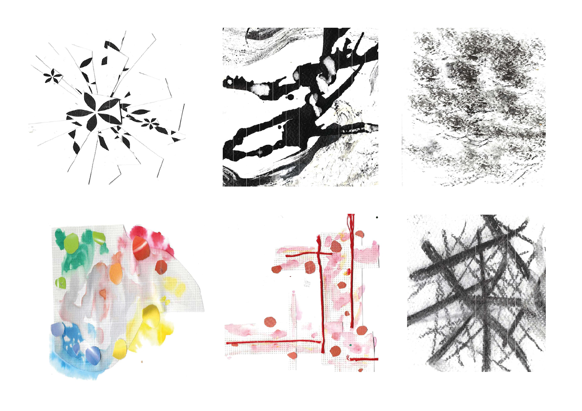
Experiments
To create the visual style, I did several experiments with a lot of diversity. The experiments were made with many different types of material.
Style
After making the experiments, I chose a few to experiment with designing a visual style, I ended up choosing the right one.
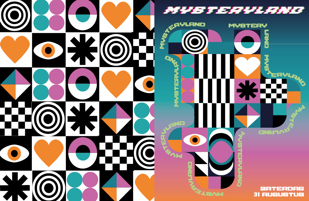
Cover
After a lot of experimentation, this became the final visual style applied to the cover, I finally chose this visual style because I thought it best suited the brand value of the festival (adventurous).
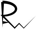
Wordmark
This is the wordmark I designed, I chose a glitch style because a glitch stands for creating unusual adventures which I thought fit well with the brand value (adventurous).
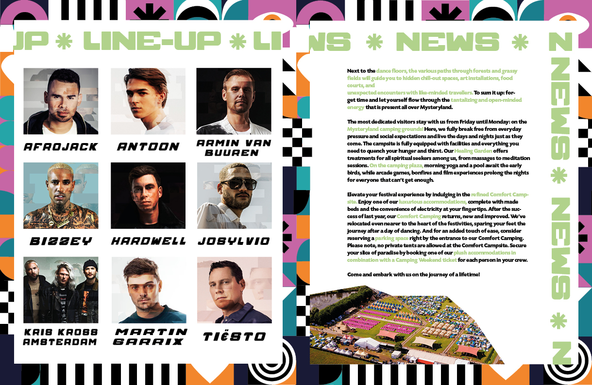
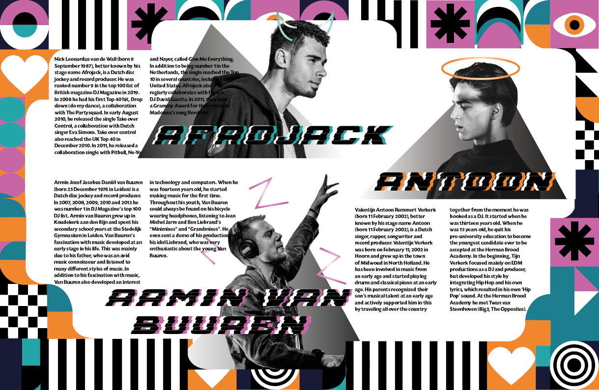
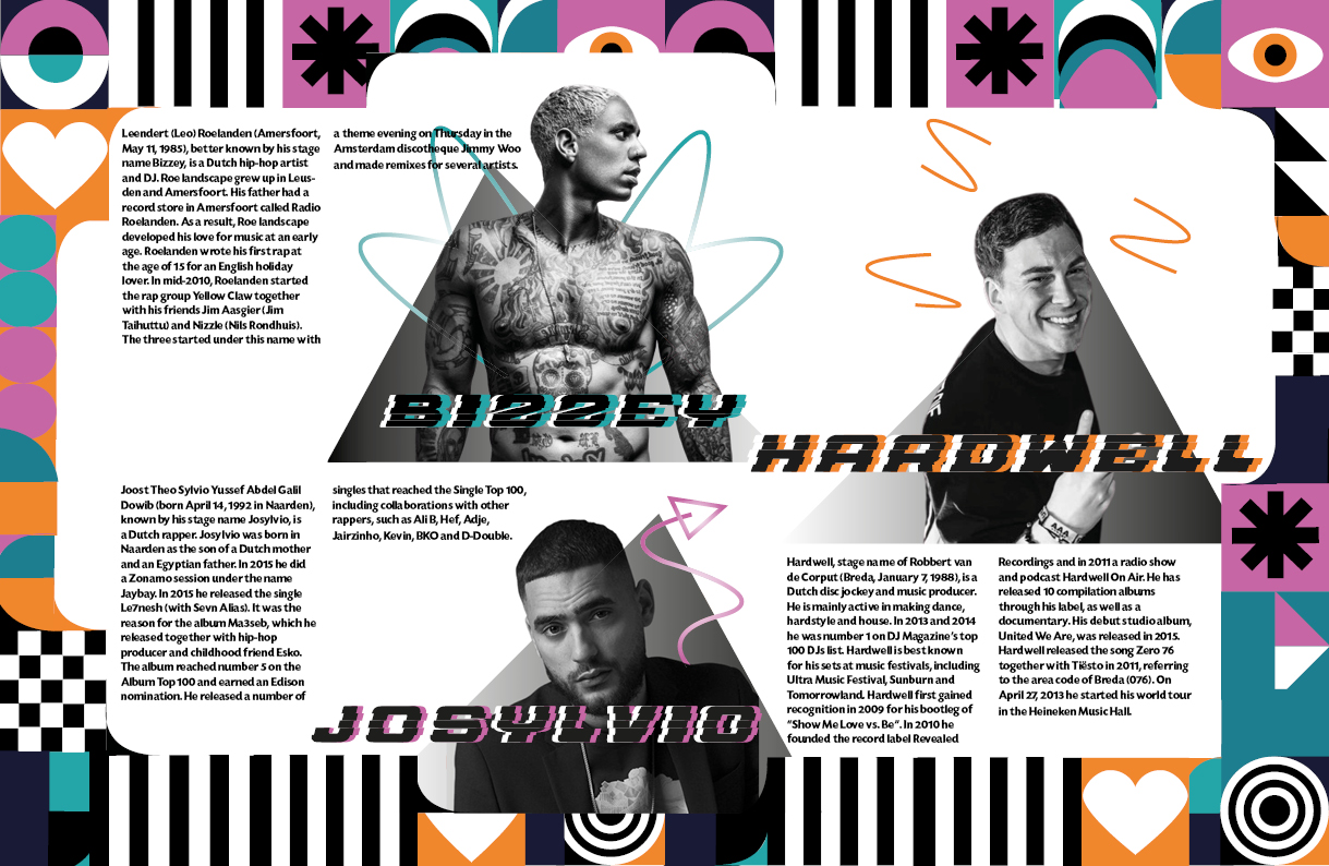
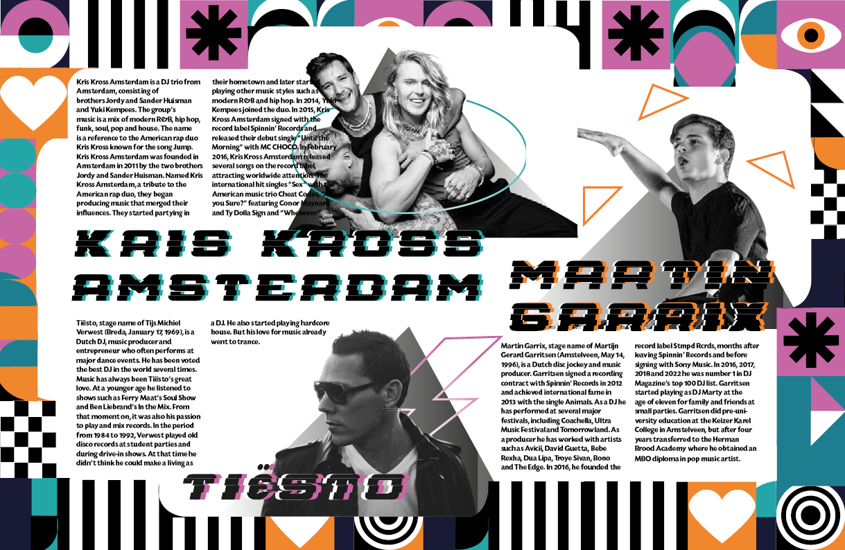
Newspaper
This has become the final newspaper; I was able to express a lot of my creativity here, it was a very educational process because I made everything based on the brand value (adventurous).
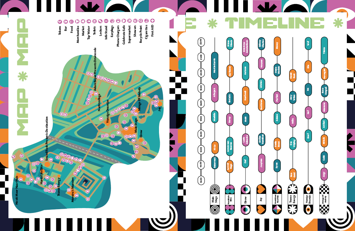
App Prototype
This became the final app prototype, again I applied the visual style. I made sure that the app prototype is clear and conveniently clickable, but also fits the brand value (adventurous).
Reflection
This was a very educational project! It was very instructive to create a newspaper and an app prototype that should have the same visual style.
I learned a lot about how to design your own visual style and I learned a lot about the different phases of designing something.